Ali Gharehgozloo

Case study 03

Biliyo

Role

Product designer
Research & IA
Flows & interface
Design system

Timeframe

2024 — 2025
Codetoproducts

Status

Shipped
Presented at AI Summit 25

Team

Me, design
Engineering team, build
Agile, two-week cycles

A local marketplace for buying and selling things nearby — listings, search, messages, and a profile that has to work for a person selling one bicycle and a shop selling forty items a week.

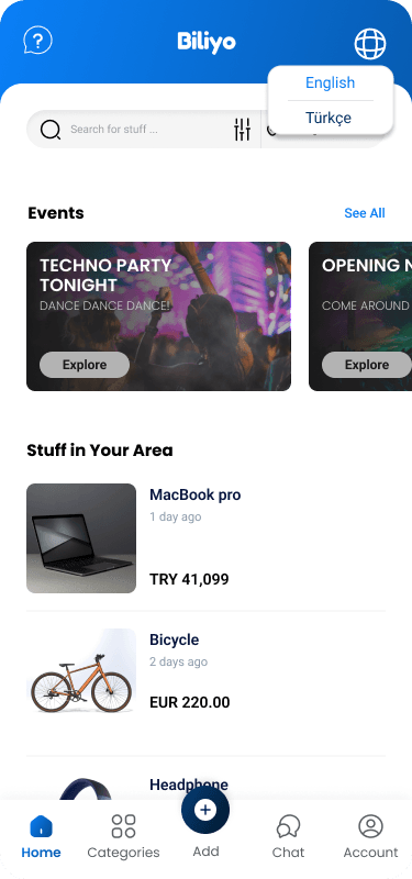
Biliyo home screen with events and nearby listings

Context

Biliyo started as a second-hand marketplace for Cyprus: people selling used items to people nearby. That premise shaped the first round of design work — the listing flow assumed one-off sellers, condition mattered more than specification, and the browse experience was built around what happened to be available this week rather than around categories.

Partway through, the business changed its mind. Biliyo would sell new items too, which meant shops, inventory, and repeat sellers alongside the person clearing out a garage.

My role

I was the designer. Research, information architecture, the flows for listing, searching, buying and selling, the interface across every screen, usability iteration, and the design system.

I did not build it. An engineering team did, in two-week Agile cycles, which is the fact that made the design system matter rather than being a tidy artefact.

The problem

A used-goods marketplace and a new-goods marketplace are not the same product wearing different labels. Used items are unique: one of them exists, its condition is the main fact, and the seller is a stranger you are deciding whether to trust. New items are fungible: many exist, price and specification are the main facts, and the seller is a business with a reputation.

The naive response is to build the second product beside the first — separate sections, separate flows, a toggle at the top. That doubles the surface area, splits the inventory in half at exactly the moment a young marketplace cannot afford to look empty, and forces every buyer to answer a question they do not care about before they can search.

Decisions

Three, and the first is the one the whole project turns on.

Decision 01

Condition became an attribute, not a division of the site

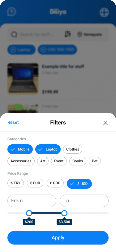
I did not add a “new” section. I demoted condition from a structural fact to a property of a listing, alongside price, location, and category — one more thing you can filter by, and one more thing a listing states about itself.

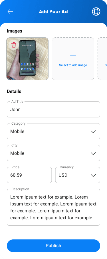
Everything else followed from that. Browse stayed a single pool, so the catalog kept its apparent density. Search kept one result set, and the filter panel absorbed the new axis without gaining a mode. The listing form asks about condition the way it already asked about category, and the product detail page states it where it already stated everything else. The screens that shipped after the pivot are recognisably the screens designed before it.

The IA held because it was never organised around the assumption that changed. It was organised around what a buyer is looking for, and a buyer looking for a bicycle is looking for a bicycle whether or not anyone has ridden it.
Decision 02

A design system built as working parts, which the engineers adopted without being asked

On a two-week sprint cadence, a designer handing over flat screens is a bottleneck. Every new screen becomes a new negotiation about spacing and states, and the answers drift.

I built the system as the deliverable instead: components with their real states — empty, loading, error, confirm — spacing and type as a defined scale, and the bilingual variants included rather than promised. Not a style guide describing intentions; a set of parts an engineer could pick up and assemble without asking me a question.

Nobody mandated it. The engineering team started building against it because it was faster than the alternative, and it became the shared vocabulary for the product. That is the outcome I am proudest of on this project, because it happened by adoption rather than by process.

Decision 03

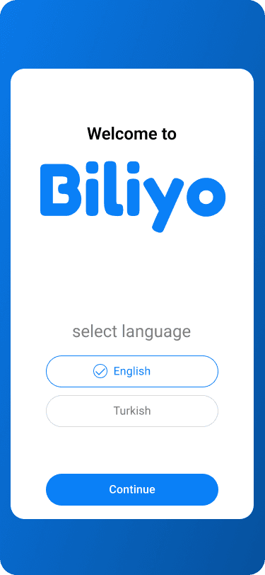
English and Turkish from the first wireframe

Cyprus is bilingual, so the product is bilingual, and language switching sits in the header rather than three levels down in settings — a person who needs the other language needs it on the first screen, not after they have learned the navigation.

Designing for both from the start is mostly a discipline about space. Turkish strings run longer than English ones, so buttons cannot be sized to their English label, headings cannot rely on breaking at a particular word, and no component can assume its text fits on one line. Every component in the system was drawn with the longer string.

Retrofitting this is the expensive version, and it is the version most products end up doing.

What shipped

Onboarding, browse and filter, listing creation, product detail for buyer and publisher, favourites, seller profile, and support — with every state drawn rather than described.

Biliyo onboarding screen
Onboarding
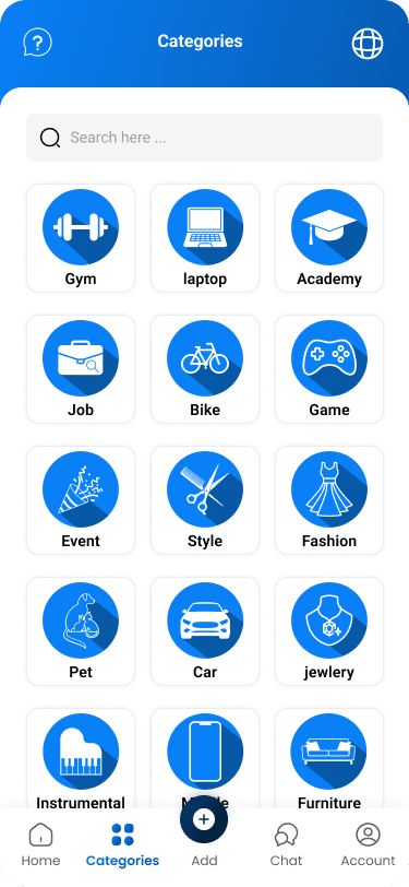
Biliyo categories screen
Categories
Biliyo filter menu
Filter — where condition lives
Biliyo product detail, buyer view
Product detail — buyer
Biliyo product detail, publisher view
Product detail — publisher
Biliyo publisher manage menu
Manage menu
Biliyo listing creation form
Listing form
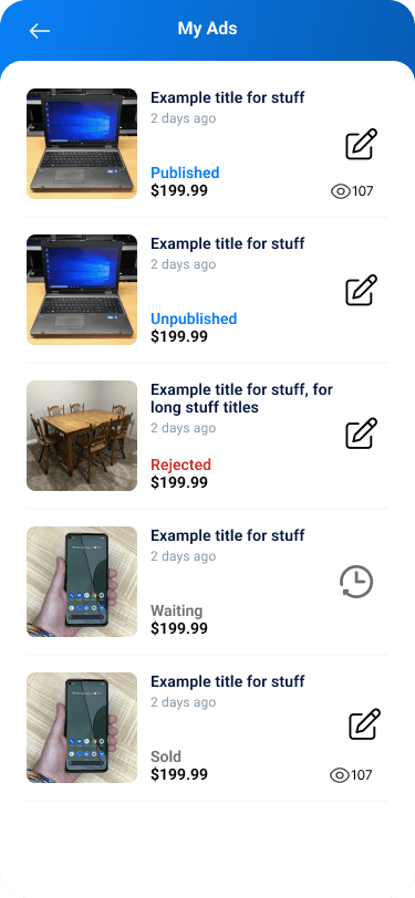
Biliyo my ads screen
My ads
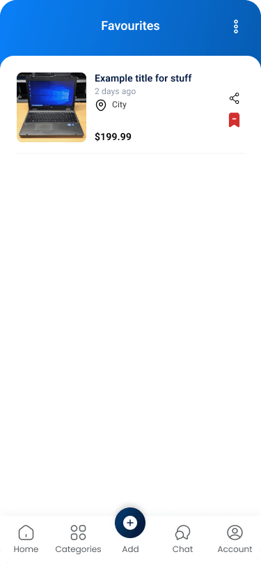
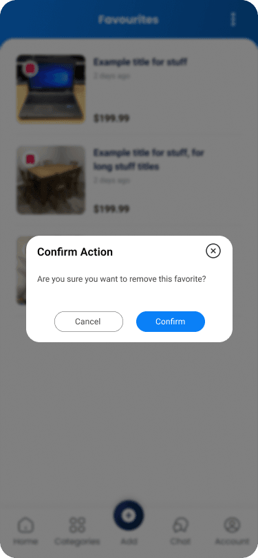
Biliyo favourites screen
Favourites
Biliyo delete confirmation dialog
Destructive confirm state
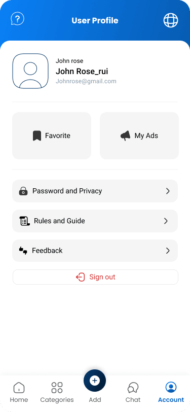
Biliyo profile screen
Profile
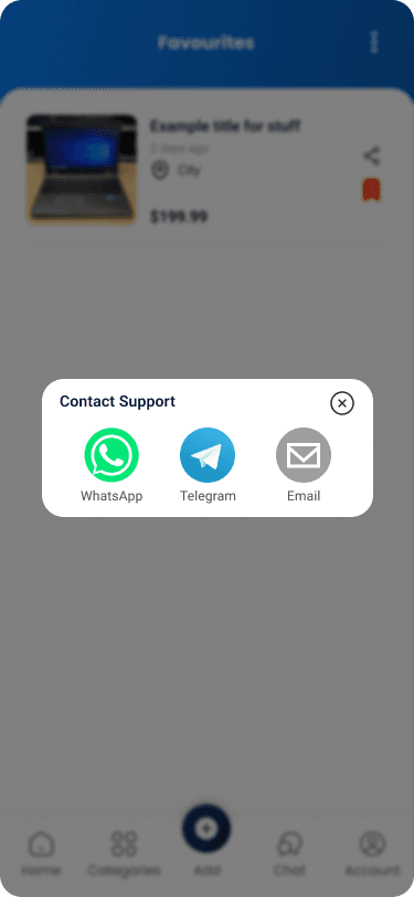
Biliyo contact support screen
Contact support

Outcome

The pivot shipped without a redesign. The new-item model went in as an attribute across existing flows, and no screen was rebuilt to accommodate it — which is the result the IA decision was made for.

The design system was taken up by the engineering team on its own merits and became the reference for the product. Biliyo was presented at AI Summit 25.

I ran usability sessions and iterated on what they showed, particularly around the listing flow. I did not record completion rates, so I am not going to quote any.

What I would change

I would have instrumented the listing flow before the usability sessions rather than relying on what I watched people do. I improved it, and I cannot prove by how much, which makes a genuine piece of work unquotable.

I would also have designed the trust layer properly. A marketplace where strangers transact needs ratings, verification, and a dispute path, and we treated those as later work. They are not later work; they are the reason a buyer completes a first purchase.

And the design system documented components well and decisions poorly. It said what a button looked like, not why the spacing scale was what it was, so the first change made after I left was a guess.

Next

All work

Seven projects, including the R&D and the short engagements.